This deserves its own page because TW is both - the best UI currently available (out of what I've tried), and maybe one of the worst designed UX applications out there.
Its a fucking horror show when it comes chart organization, picking which multichart window chart shows what ticker (focus driven, as in focus -> then click the ticker). You can't drag and dock sub-windows like you can in other software packaged. Even the TWS which is made in Java somewhere in an Indian slum by a led poisoned cripple allows for more intuitive layout organization. We have the fucking tech guys.
Look at Visual Studio, TC2000, etc... why can't you make it that easy to dock charts? Moron in charge of UX? Likely.

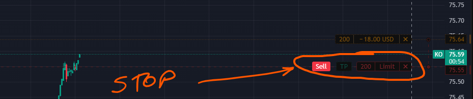
What REALLY FUCKING GOT TO ME is that when you place LIMIT ORDER it looks like this:
And this is STOP LIMIT:
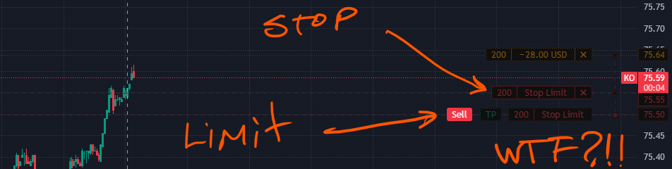
Why?! Why do you fucking switch the UI and not indicate which is fucking limit and which is fucking stop.
But even more than that, WHY DO YOU ALLOW LIMIT BEHIND STOP?! It will never hit!!! Pop a warning. Teach the user.
Whoever made this decision doesn't fucking use this system. They made it, some jackoff approved it and everyone moved on. I guarantee you a lot of people were wondering why their well timed orders were not executing because limit is now behind stop.